Behind the Scenes new colour update! #2
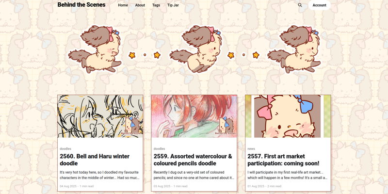
I learnt a little bit more of how much I can tweak around Ghost's theme, so with random edits here and there I tried to make it looking closer to my website! It has a lot of Kittys all over the page hahaha...
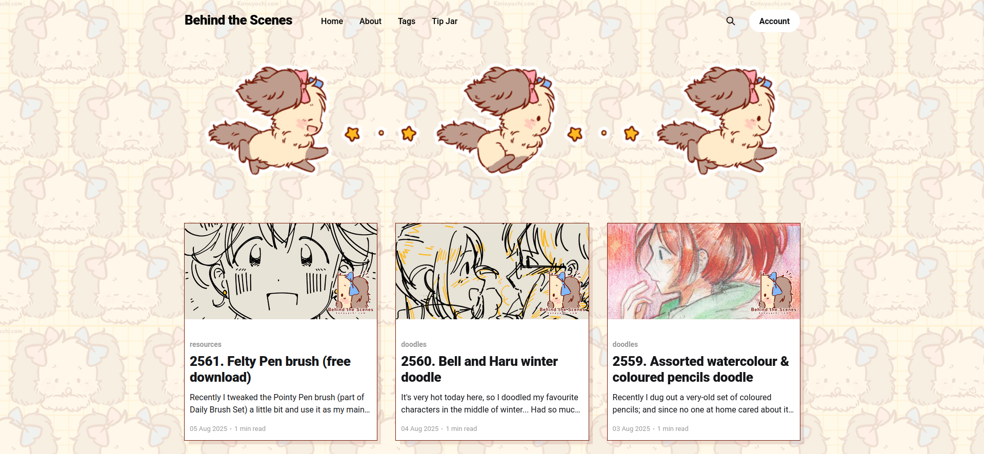
Since the background is now with a pattern, I need to make sure the texts are still readable. So I added background-color on each 'post-card'. It looks cute actually! Makes me want to update my website to look like this too...
For the post pages, I also gave it white background for better readability. I wanted it to be less white, but for some reasons the colours didn't turn very nice against the Kitty pattern...? I made it white with a little bit less opacity for now. I may tone it down later.
The soft brown accent colour is really nice, so I keep it. The original bright yellow accent colour is actually the colour I picked for my brand signature, but it's a bit too bright and it makes it hard to look/read sometimes – I wanted something softer.
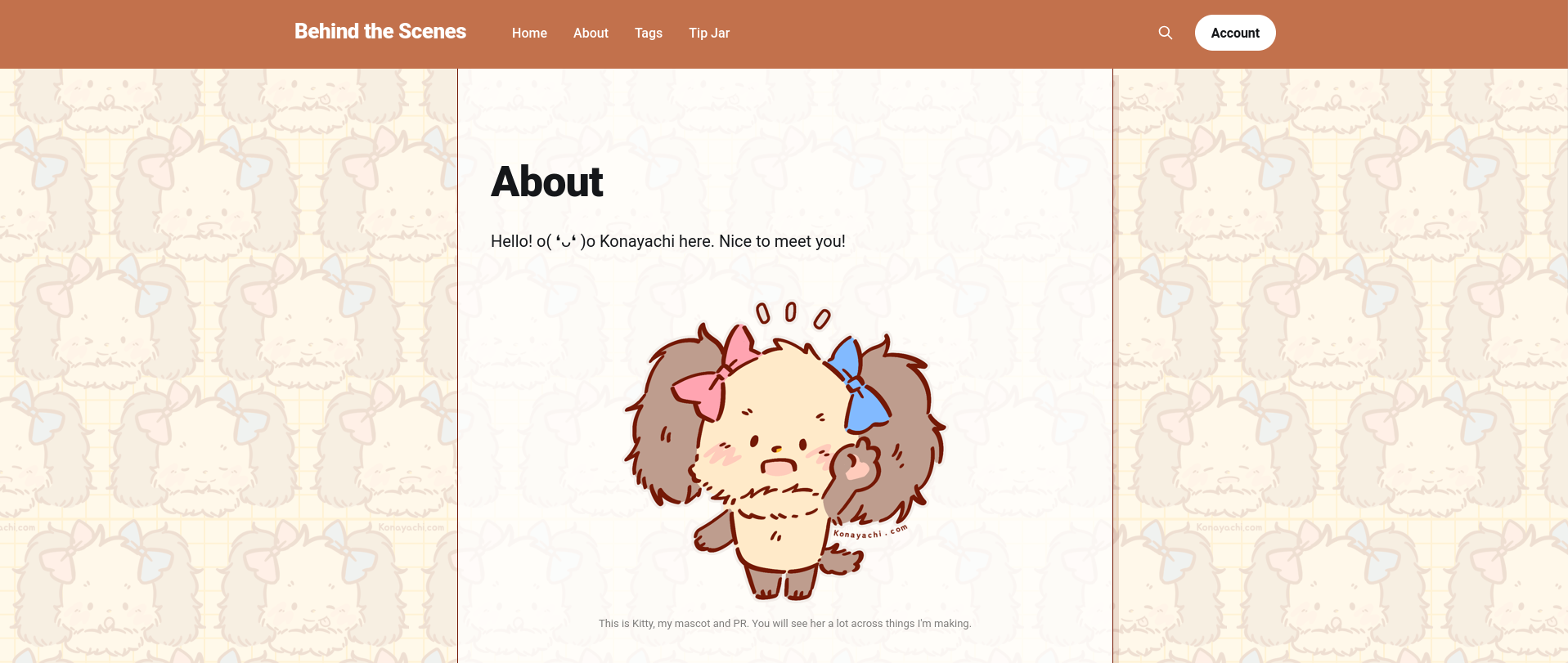
The soft brown colour from the first theme update was really nice and I loved it, but since it's using an illustration I did, I figure that at some point I really wanted to change it. I don't want to keep thinking about updating the header art and having to update it across sites is stressful. I decided to stick with a brand and use Kitty for the header.
For now, Kitty works! ✨
This Kitty art I used was made in, uh, 2022? 2023? Something like that. I even used it as my VNs splash screens... At this point I'm too CBA to make a new one haha. I think it's pretty neat!