Behind the Scenes new colour theme
I've been playing around with Ghost's new official theme: Source. I love how I'm able to change the background colour other than white or black, and in many cases it looks pretty sleek.
There's one thing that it doesn't have (in comparison to Casper theme) that I believe is extremely important: paid posts' thumbnail marker. I stepped back in switching to Source theme because of this. It's very sad, though, as I like the new theme.
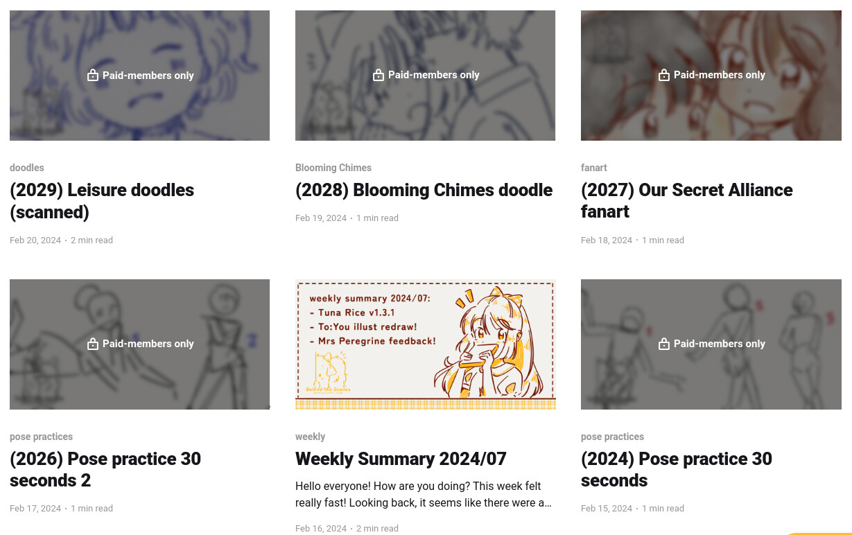
Thumbnail view of Casper theme vs Source theme.
I asked a question about this in the forum: here.
I really don't want anyone who are not paid members unable to find which posts are public and which ones are not. I don't mean to deter them from looking at the thumbnails (they are public, you can see them larger if you go to the posts although the content is locked) but it should help skip the locked posts and go straight to the public ones.
I still don't have time to learn about custom template routing to display posts based on their accessibility, so that has to be in the future.
I asked about this in the forum as well: here. When I get around it successfully, I'll also share it in the forum if the post hasn't been locked yet.
Alright, so, what now?
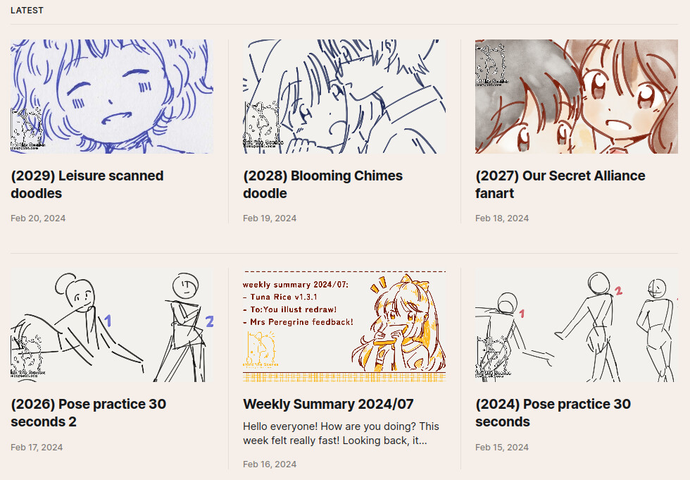
I then looked around the code of Casper theme to get the things I love from Source theme. With small tweaks here and there, I'm able to do it, I think?
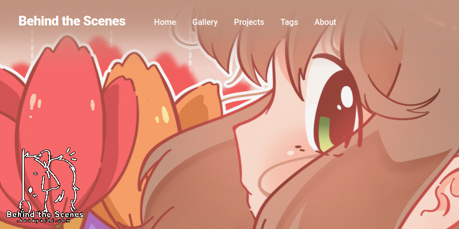
Old view:
I like how straightforward everything is. The only thing I don't like is that the navigation is too hard to read.
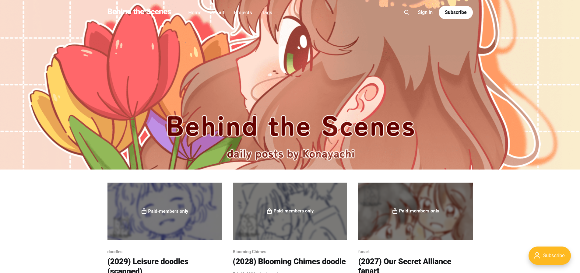
So I tweaked some colours:
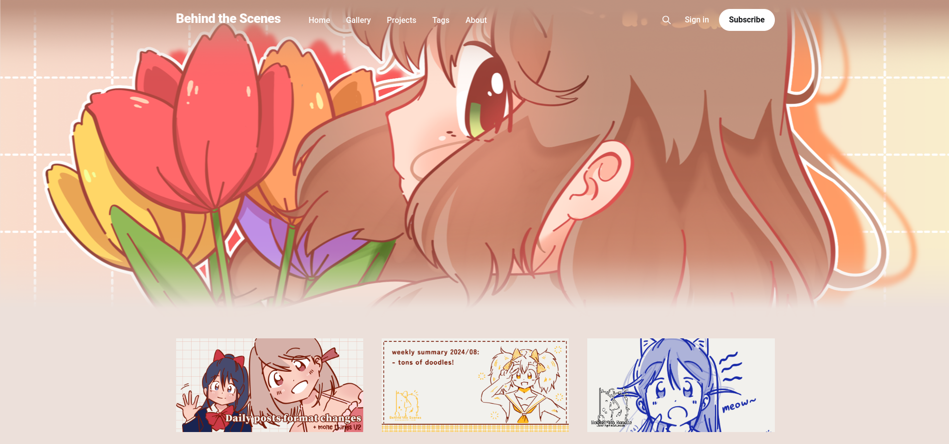
I hope it's easier on one's eyes. I just colour-pick Pippa's (the header) colour palette too hahaha.
See you!
- Konayachi