Weekly Summary 2023/02
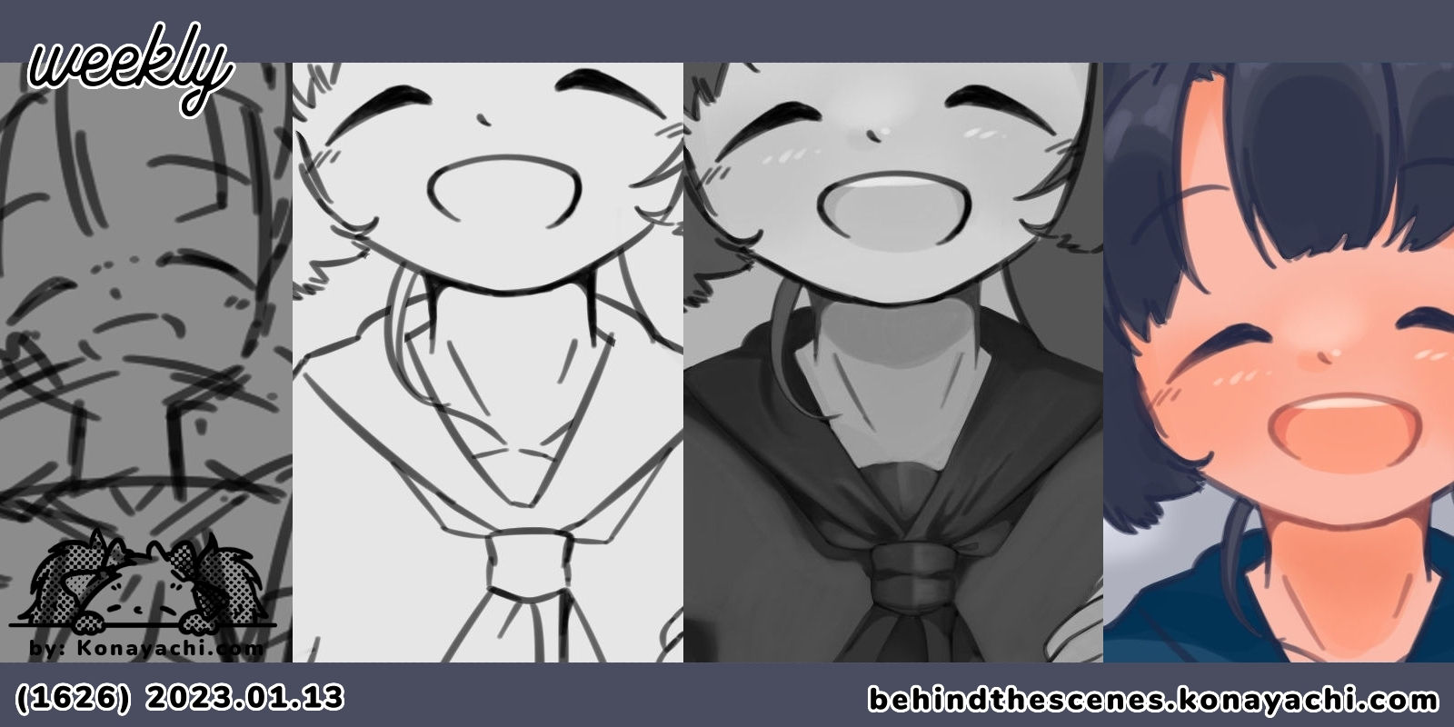
Hello! This is my second weekly summary of the year. Things went a little bit slow this week since I needed to take a break away from my desk for a good few days. But all is good now!
07 January: (1620) Sumi / illustration
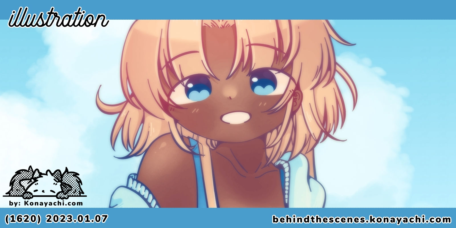
I added soft background to Sumi pin-up illustration that I did last week. I also made two final versions of this illustration with different colour tone: soft and vivid. I like both of them and I have a hard time choosing which one is my favourite.
08 January: Illa Café Dev Notes 36
I resumed my weekly Illa Café Dev Notes! I still work on it but without schedule to report, my work balance became erratic, so here it is. In this post; I wrote that I've reached chapter 11, established new details and learnt some cool new stuff about RenPy.
09 January: (1622) Cold Morning / sketch
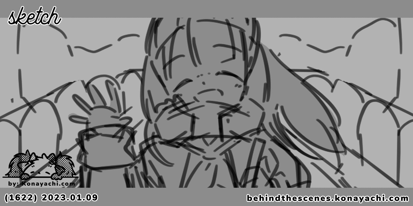
I started a new illustration! This time it features Bell, in school uniform. There were things I expected to do in this piece. It was good to think and plan those, though!
10 January: (1623) Cold Morning / lineart
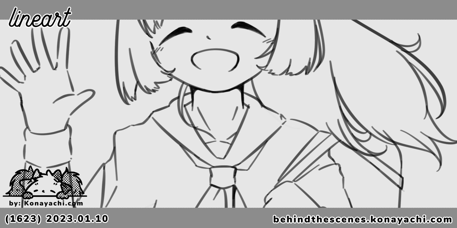
I did lineart of Bell illustration. I used soft brush, thinking whether I wanted to go through this illustration in painty way or solid colour way.
11 January: (1624) Cold Morning / greyscale, wip
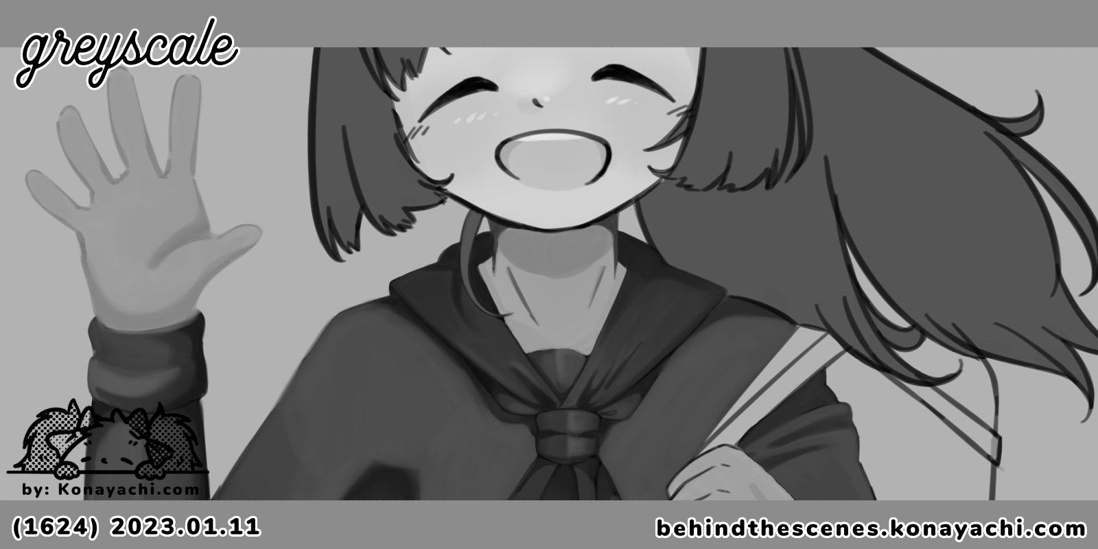
I worked on initial colouring of Bell illustration; it was really fun to do, but I unfortunately was unable to work on this further (health reason); so I wanted to do another retry at similar experiment on a different illustration.
12 January: (1625) Cold Morning / illustration
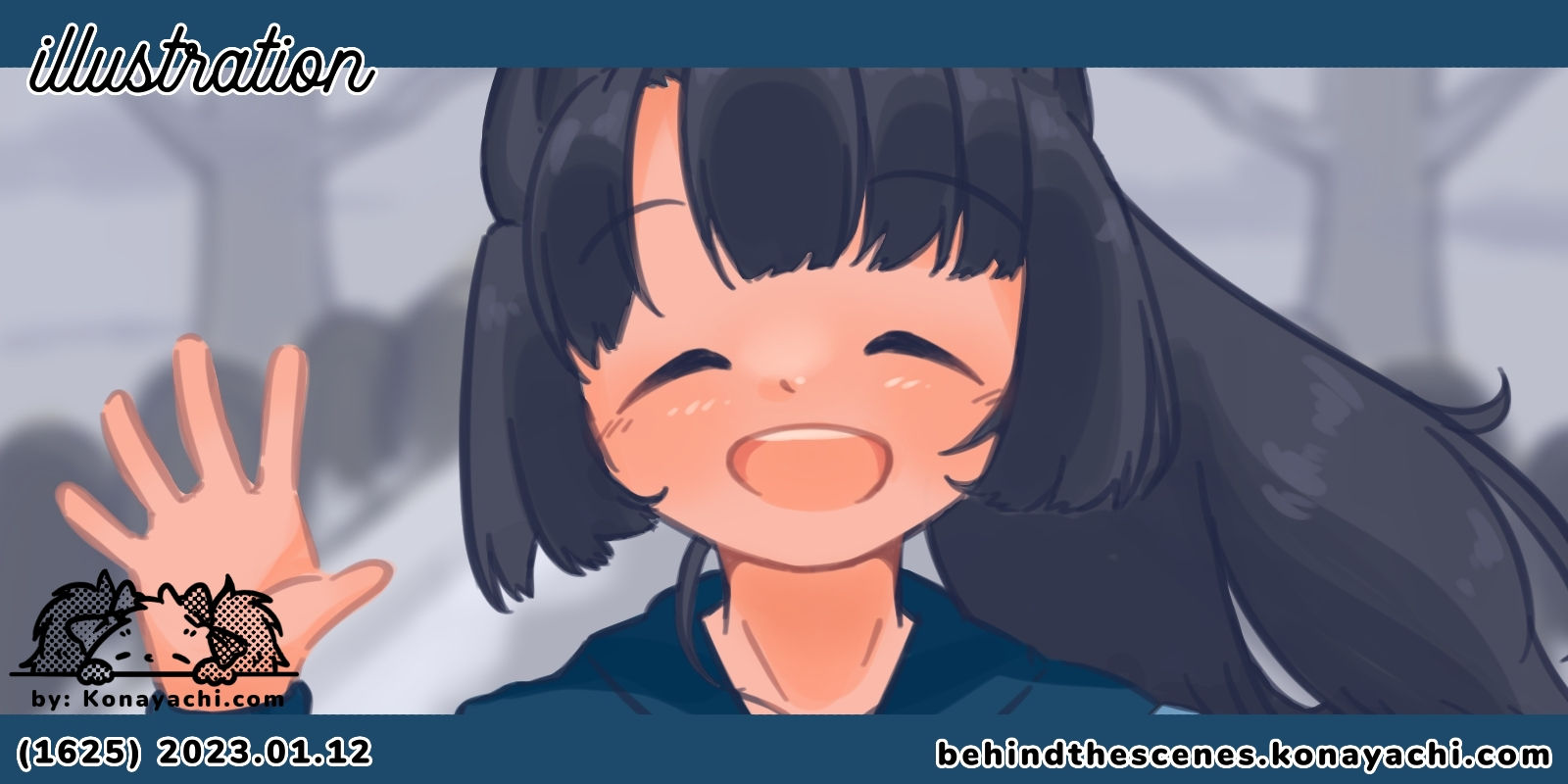
I finished the illustration with colours and simple background. I made two versions of the full illustration with different vibes, they give different feel and are good in their own way. 💙
This week I was not as productive as I would like, but I (want to) think it is for a good reason. I was able to sleep and rest a lot, caught up with some old episodes of Running Man and refueling my creative energy back to health. 😆
Also I watched some interesting YouTube videos from Saito Naoki sensei, that opened my mind to many new perspectives of drawing interesting illustration. One of the most interesting one that I watched was the video about lineart and how he said that perfect and smooth lines are sometimes not very useful to show movement and 3D feeling (minute 10:36). Sometimes, "broken off" linearts can give different feeling of an illustration, such as dynamic movement and expressions. I find that very interesting as I've seen lots of other theories saying that smooth lines are one of the main key for smooth illustration. But I guess, for different purposes and intention, smooth lines are very nice indeed!
I'm relieved that I understand why my sketches sometimes feel better; because the broken lines actually show more things than my smooth lineart lines. So, there's a reason for this phenomenon!
Please check him out, he makes interesting videos! I'm grateful I come to find him as he helps me a lot in opening my mind for many perspective of making art.
That's all for this week's Weekly Summary! I hope you enjoy your Friday. See you. 🧡
- Konayachi
