2542. New Kitty icon
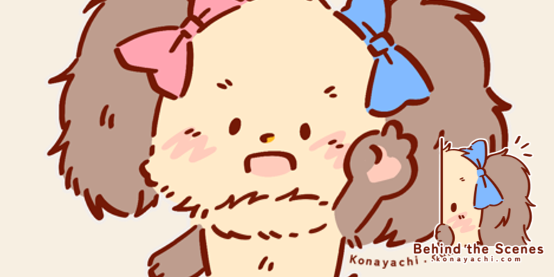
After concluding my latest commission, I was seeking for a chilling activity. I did some website maintenance: move things around, clean up files, fix grammar issues that I notice (after years), etc. I look at this old Kitty icon on my homepage:
and think that it can do a little refreshment!
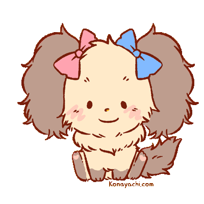
New Kitty homepage icon after, uh, 3 years? 4 years?
My first thought: I feel like I understand the "character redesign" syndrome that many big IP holders did! For example: My Little Pony. The redesign ponies are more stylised and deformed. Older ponies design has special place in my heart, but newer ponies design grows on me as well! And I feel like I unconsciously did the same with Kitty.
She is now bipedal(? probably only for this icon? I think she would still walk on her tiny four legs actually?), way shorter, and fluffier. I drew Kitty a lot around places for my branding, and the more I draw her, the more it's easier to show her if she's more stylised with assertive lines. Bipedal Kitty can have more expressions (e.g., holding items, cheering for you, behaves more like a human haha) and I think that's nice!
Also, the latest Kitty design has all of this: the ability to maintain generic shape (large head, ultra fluffy lop-ears) and the perks (two ribbons, neck fluff) – and draw this shape countless of times with speed. It's as if I unconsciously make her design more convenient! For branding (and especially with very limited colour and space), more distinct shapes and lines are better than detailed ones.
And then, I looked at Kitty's first design I made in 2016:
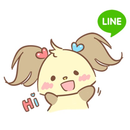
Actually looks so cute??? 😭 Very simple and rotund.
I really like all designs that she went through. I just hope she's noticeable enough as a mascot!